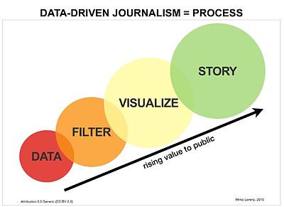
From the Wikipedia entry for data driven journalism, we have the following brilliantly subversive chart:

The Y-axis appears to be "Value to Public"; what's the X-axis?
While I think the author was aiming for "User Engagement", the data appear to equally well fit either "Level of Bias" or "Distance from Reality".