The Visual Display of Quantitative Information by Edward Tufte
The lessons of this book:
- Graphs should allow the viewer to examine the data and invite comparison.
- Good graphs are almost always multivariate.
- Maximize the ratio of (ink used to show data / total ink used in graphic)
- The representation of numbers should be proportional to the numbers themselves.
- Label clearly
- Always use invariate units (nominal dollars depreciate with inflation, use
real dollars instead).
- Do not quote data out of context.
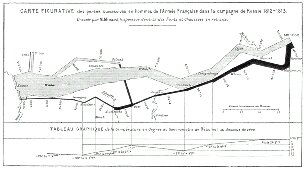
At the end of this book, you gain a more critical eye when it comes to Graphs. Check out this graph, it shows the size of Napoleon's army as he marched from Kowno, Poland to Moscow, Russia that winter of 1812-1813. It's amazing to see how much damage river crossings does to lesser-technology armies.