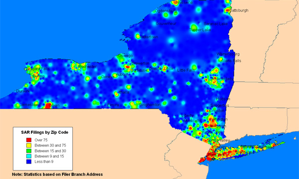
A recent MIT Technology Review article on suspicious activity reports has the following non-informative picture showing the geographic distribution of suspicious activity reports per zip code in New York.
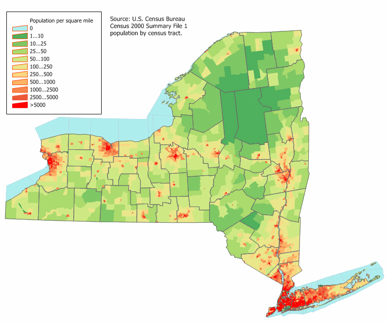
The graphic sucks because it just shows us where people live in New York. Which we could have gotten from wikipedia, i.e. this graph:
We actually wanted to see the number of suspicious activity reports committed per 1000 people in each zip code. That would have showed us immediately where the hot spots for financial crime live.