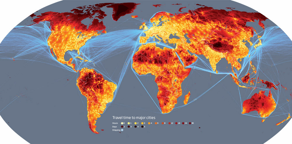
This map of travel times to the nearest big city doesn't quite do the trick. A much more interesting map would be global travel connectedness, i.e. for a given location how many hours are you from any other point on the globe when taking public transport (planes, trains, taxis) when available. Too bad they didn't expose the underlying data, we could have hacked up an improvement.


Good point. The map shows remoteness better than connectedness. That said, it would be interesting to see versions of this map going back through history. Further to your point: a human transport version of CAIDA's AS connectivity maps?

The historical would rock; pick a viewpoint and watch the rest of the world wink in and out of closeness depending on what waterways and empires were open. -- Patrick